


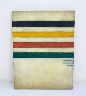
 However I Love these vintage paddles I spotted on remodelista. Coming off a road trip of Jamestown, Hingham, and St. Michael's they feel super appropriate.
 Over my Napa Valley Easter we stopped in the Bardessono Hotel in Yountville to see their Green design. The hotel / spa is awesome. It seems as though no detail was left out. My favorite of these details was this Air Plant wall. How cool does this look ? It was in a hallway connecting the front desk area to the pool. Such a great original + stand out piece.


 You might not think of your home as a product, but I do. I view homes as not just one product but possibly two or three. We're always representing or selling ourselves on some level, right ? The way we dress, the things we display, the editing we do when speaking to one person or another. Whether we're trying to prove something, or if we end up showing that something is of non-importance to us, a message comes through. Then there is a the level of, if we're home owners, our house is a commodity that at some point we'll most likely choose to sell to someone else : a product. And lastly many people employ designers (to help them with my first reason), and with this, the house becomes a representation of the designer or architect and the product they have to offer.
 I spotted Bleu Nature at Calypso home in Soho. How beautiful are these lamps ? Of course, leave it to the french :). The first one literally stopped me in my tracks -- so simple, but so right on. I'm a sucker for bringing nature indoors. I want to see them in a perfectly crisp white room. I think one lamp would carry the whole space.



 I'm decorating for a few friends here in the city and was sifting through rugs this AM. I came across this doormat at Urban Outfitters asking me to please not leave, and it made me so happy on this rainy muggy morning. My mom used to have one of the "Please Go Away" doormats. I had to tell her I didn't think the sarcasm was cute. Probably none of my business, but I like to be welcomed, I thought she should know. Now you can welcome your guests + keep them as long as possible.

 Maybe you have more spices than S + P on your dinner table on any given night. If you're like my sister, you need "Slap Ya Mama" Cajun seasoning inches from your plate with any given meal (not the most attractive container). And if you don't, maybe you'll suddenly feel the need for them once you've seen these. I for one, think these cuties are works of art, and an amazing addition to any table.


 When I was younger I thought bright colors and fun patterns so much fun for plates. And then a while back I heard someone on the food network (Ina I believe) say how important white plates were in order to let your food be your art. I've remembered it ever since, and it couldn't be more true. Perhaps some of it is a food trend thing :: like in the 80s, Lo Mein doesn't look so pretty whether its on turquoise or white. Or in the 60s meatloaf was still a brown hunk on a floral or a solid. But today so much of what is in is also beautiful. The farm-to-table and whole food movements have really changed what we're looking at. Beautiful roasted beets, chicken under a brick, or brussel sprout leaves should be showcased. They should be savored by the eye, just like each bite should be savored. Here are two plates that are on my list of must haves. Both can be found here, again, by the ever talented Heath Ceramics.


 Some parting pics from Telluride that I love. Notice the pottery displayed in the kitchen -- beautiful, very popular, Heath ceramics with a nice mix of kitchy moose mugs. Perfection.

 So this is a little "week" spillover. But look at these great chairs ! I love the shape of the top, and the fact that the fabric and blanket at perfect Colorado, while still neutral, and nice enough to be in their formal living room. And the bottom is clearly a vintage find with recovered cushions. It was in a room with bench seating so it was perfect without a partner. And who doesn't love a rocker ?


 This " guest house " is no bigger than a big backyard shed, but it was perfect. It had everything one would need -- a huge comfy bed, a nice TV, alarm clocks and an amazing shower. Plus lots of windows we could open to hear the rain beat down or the bear eating out of the trashcan (yes, big scurry bear !). The simple materials continue from the house, and work perfectly in this small space. I love the touch of the rusty saws and horse shoes on the side. They are simple and camouflaged enough that they're not at all kitchy.


 I think the best proof of use of space is if you cant take small snapshots (even in your head) of a room, and have it tell a story. Of course before even that comes functionality. Is space used efficient and effectively. But that's sort of obvious. After that, can you break corners and settings up into little moments ? Moments that stand on their own ? I could write pages about each fragment above, and some aren't more than a foot or two in this home.
 I'm aware that plenty of people have exposed piping in their basements due to a lack of finishing. Its them + their sheets down there in the dark, so why would they invest in it ? This basement laundry room also had exposed pipes. But not for a lack of finishing. I LOVE this white pattern it has created over the machines above, and the awesome grid those little switchboards (?) created on the wall below. One, white pipes on a dark wall, the other, dark mechanics on a white wall. And again, less is more.
 I loved these bathrooms. LOVED. And these are only photographs of two of them. But one of my favorite parts was the continuity. I only need to show you two bathrooms, because there were so many similar details in each of them. To start, if you look above they're very simple. This white, and in other rooms creamy-white, bead board was used throughout the house. I have always loved bead board. I almost used it in my apartment, but decided against it. Next place, definitely using it, and this house was proof that it works in more than just New England beach cottages. It was right at home in this mountain house. Also to note above is the sky light. There is nothing spectacular about it, but it is so perfectly off center between the two sinks (this is the master bath), and it open up the slanted ceiling (literally and figuratively). Lastly, this simple gray stone on the floor. They were simple circular shapes (pentagons ? Hexagons ? I never counted sides). They were a cool grey in the sunlight and warmed in the night to a soft purple.
 Also of note is the light fixtures. These grew on me more and more the longer I was there to the point that Im obsessed. I've been searching for them online to use in a clients home, and have yet to locate. Not only do I really enjoy the minimalist cage, but this was the only ceiling light fixture in the entire house, and there were a lot of ceiling lights. Again, I loved the continuity, but I also loved how when you found them smack in the center of a ceiling they took on a larger presence, and I was drawn to their lines, and when there were multiple lights in a room and they weren't centered, they took a back seat and melded into the setting--never unbalancing a room or taking away from other features.
 This phenomonal shower was in the basement. Yet again, less is more. There is no fancy tiling or color -- there is the actual structure of the house. The bright light keeps it from being cave like, the bead board is kept, this time on the ceiling, and the very in subway tile on the back (which I wish I had a better shot of) is fixated with very dark grout (also used upstairs) for a much edgier look. And of course in this minimalism, they manage to not sacrifice luxury with elements like this huge overhead shower head (LOVE these !) Notice the Biolage shampoo, conditioner + washcloth ? Same exact in every bathroom. My money is that they were picked out for their bottle. You don't even have to lose design on elements like product :).
 And lastly, this fantastic fantastic piece is also in the basement. This window is over the toilet, and since it's the basement it is level with the lawn. Instead of a simple shade they have this mirror which slides along a track to either let in the light or give you total privacy. The mirror helps open up the small space when there is no natural light, you get great slips of light framing it, and lets face it -- a mirror on a rolling track is just cooler.
 We all make the trek to Telluride Colorado for the great outdoors. There is clean mountain air, skiing in the winter, hiking in the summer, and so much more. So while I was out there last week for the great outdoors (okay, including an outdoor concert), I was pleasantly surprised to stay in one of the best designed houses I've ever been to. Every detail was so thought out, yet never overdone, and all keeping in a relaxed, small ski town vibe. I was beyond impressed. In fact if the home owners knew how many pictures I took of their belongings they might be creeped out.

